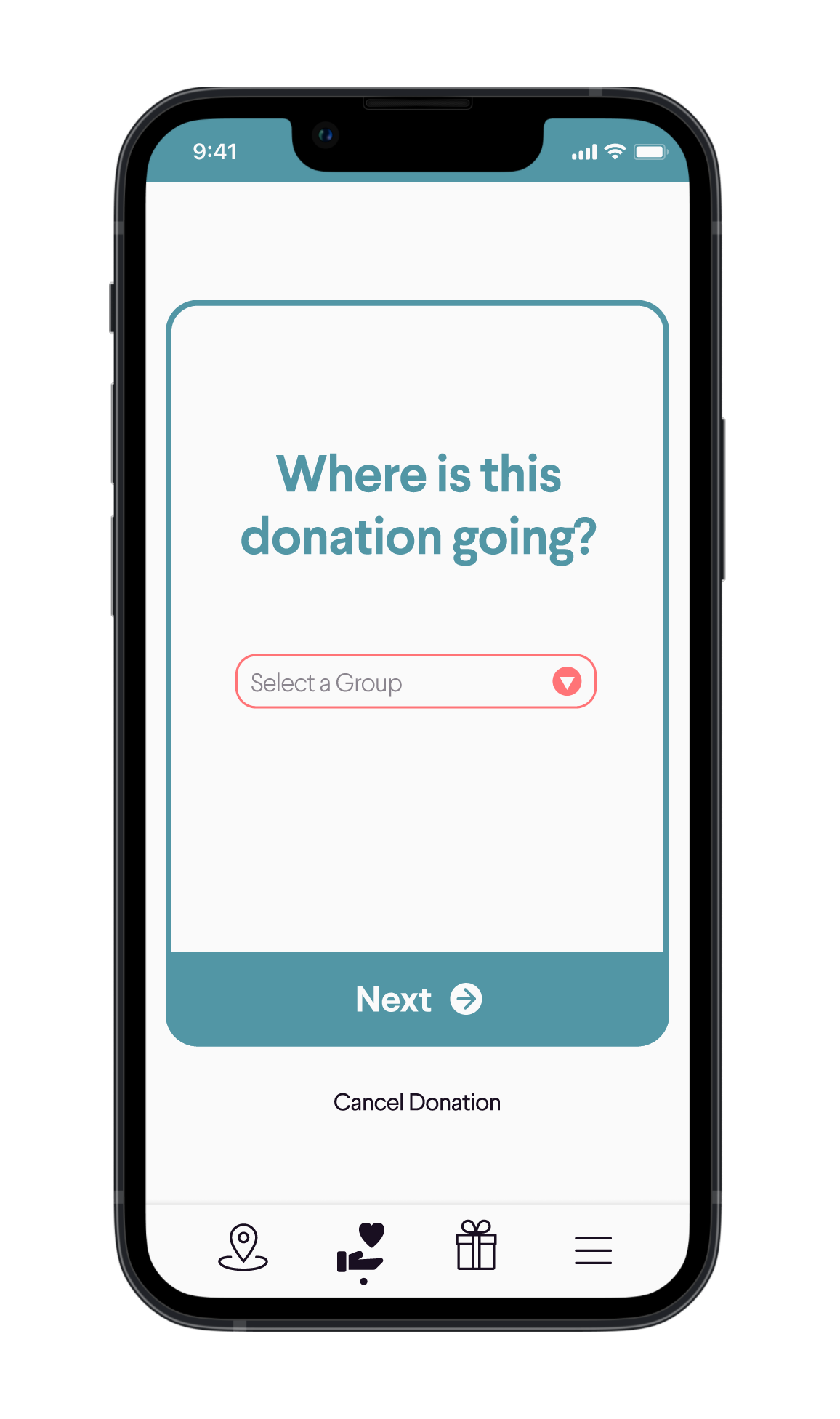
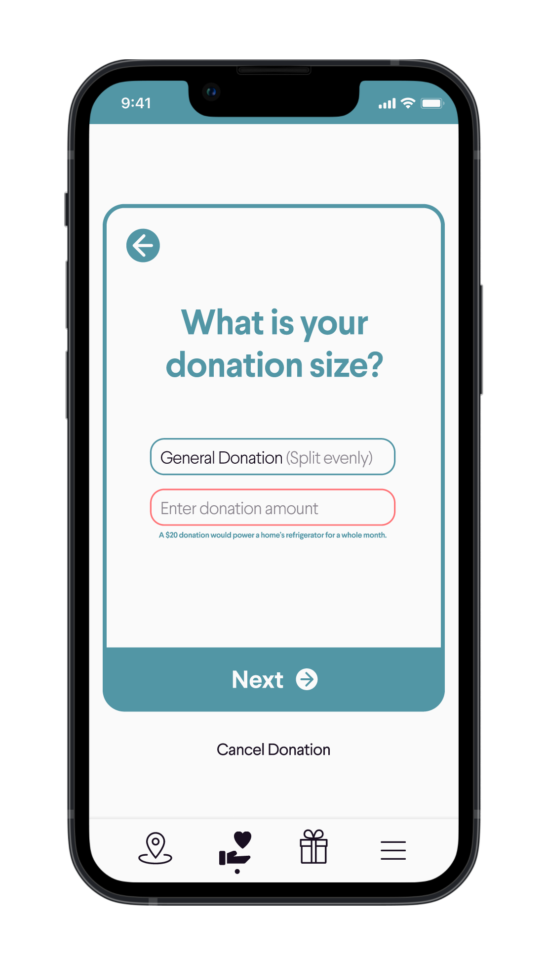
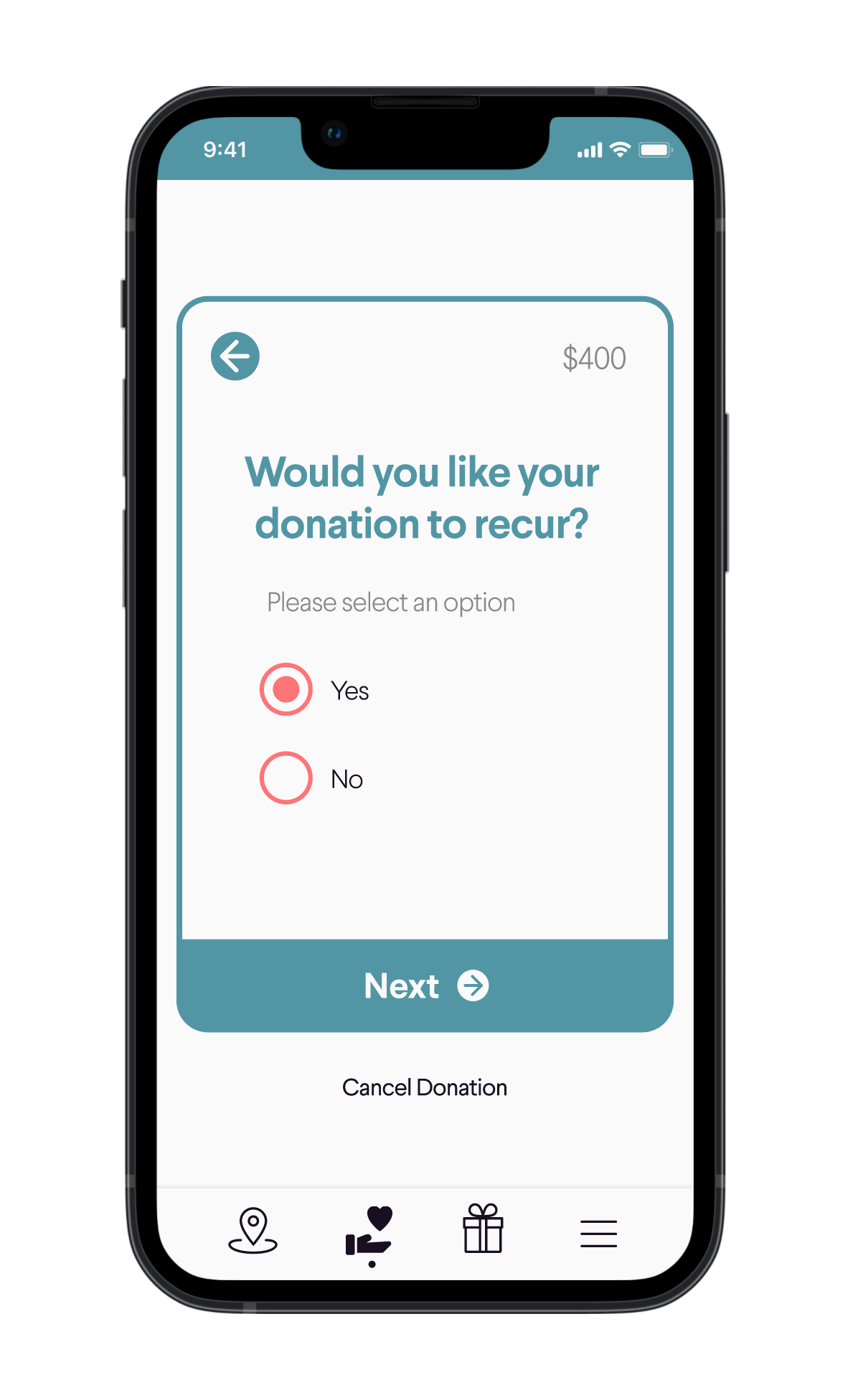
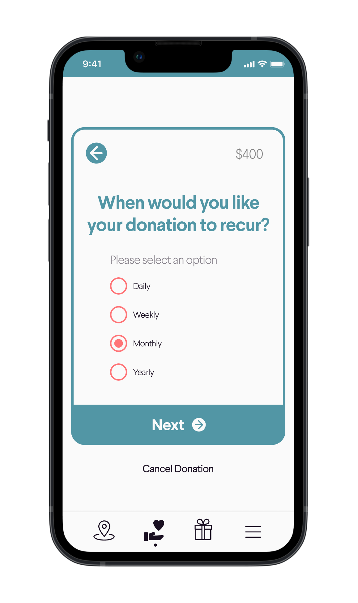
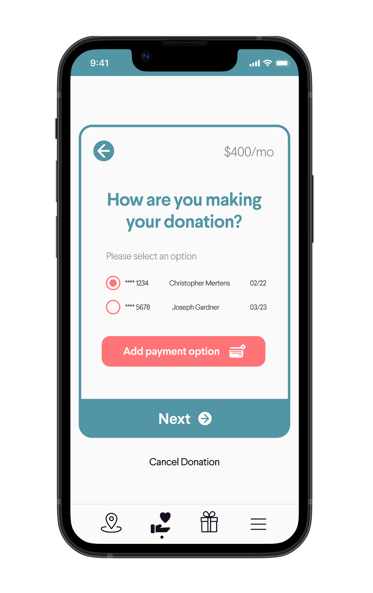
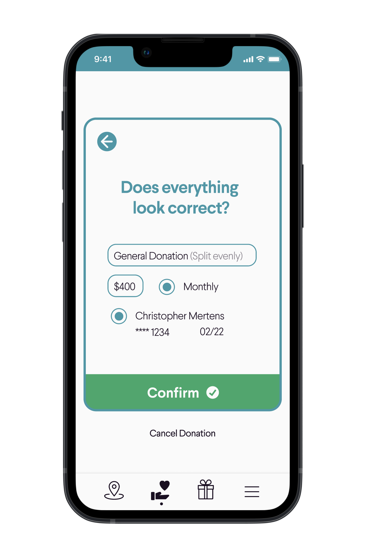
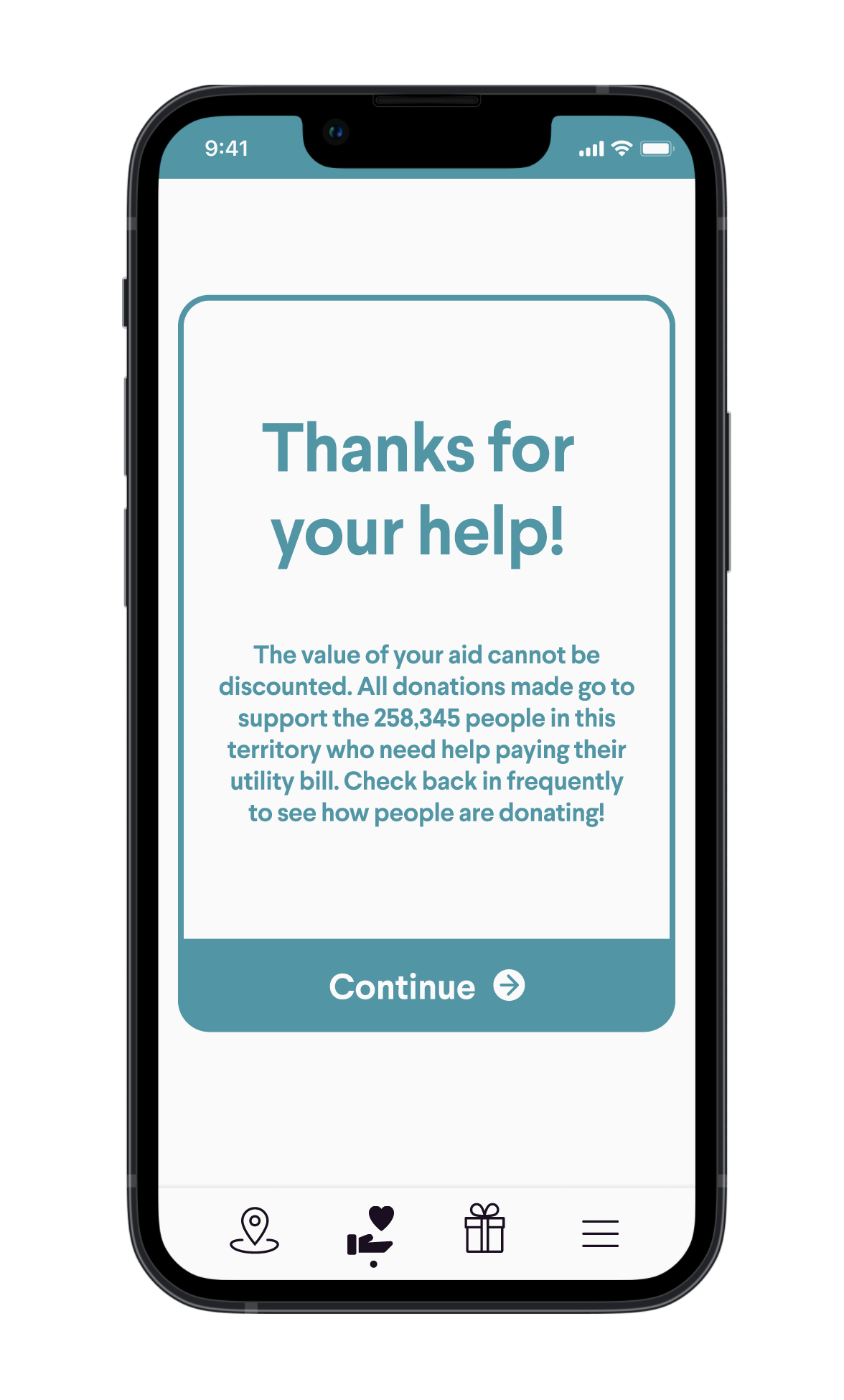
Despite the wide scope of the blossom mobile app, the design I'm most proud of is this user flow for setting up a donation. Since the app is targeted towards every kind of user, I wanted to make visibility and clarity a priority. I tried to create as much contrast as possible, and strategically crafted the text so the modal stayed the same size - that way, the "Next", "Back", and "Cancel Donation" buttons would stay in the same place to prevent mis-clicks. I also researched different types of visual impairments and colorblindness, and consulted various guides to design with accessibility in mind.